
Stress Heat Map
How to interpret BeamTracer's stress heat map visualization — the color scale, what causes red segments, and how to fix them.
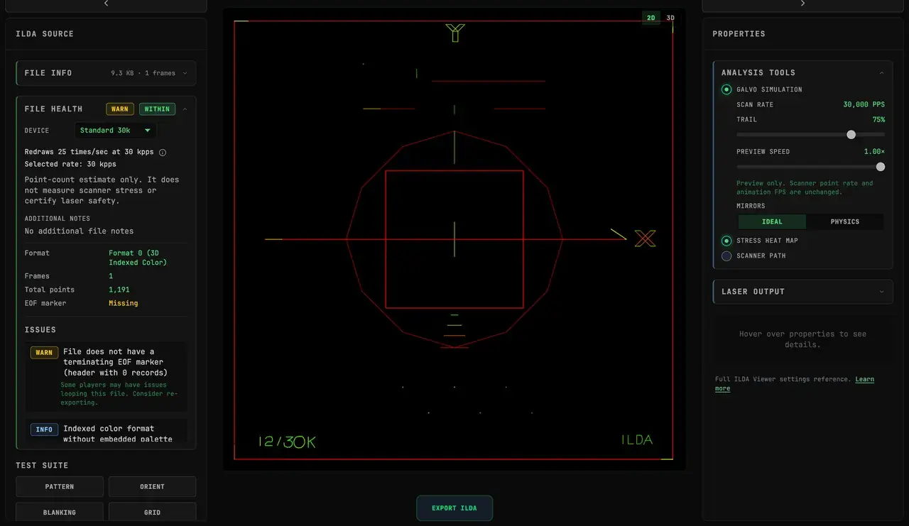
In the 2D Viewer with GALVO SIMULATION enabled, STRESS HEAT MAP colors the difference between commanded and simulated mirror positions. Green means smaller deviation and red means larger deviation; neither is a safety verdict. Scanner presets approximate a class of hardware, not a calibrated projector.
With simulation off, the heat map adds the jump-distance view described below.
The Hidden Problem
A file might request 15 kpps and still show large coordinate jumps. Why?
Because PPS counts records, while the heat map compares the distance between adjacent coordinates. Two files with the same point count can contain very different paths.
The heat map highlights the larger jumps. It does not measure force, temperature, optical power, or hardware damage.
Reading the Colors
When you enable Stress Heat Map, line segments are colored by jump distance:
| Color | Threshold | Meaning |
|---|---|---|
| Green | Shorter relative jump | Small coordinate change |
| Yellow | Mid-range relative jump | Larger coordinate change worth inspecting |
| Red | Longer relative jump | Largest coordinate changes in the visualization |
Common Culprits
Scattered Text
Text with letters far apart creates massive jumps between characters. The word "HELLO" centered on screen may have 5 huge jumps — one per letter.
Opposite-Corner Shapes
Two small circles in opposite corners of the image create a near-full diagonal coordinate jump between them.
Teleporting Animations
Animations where objects suddenly appear in new locations can create large jumps between adjacent frame coordinates.
Poor Blanking Optimization
Files from basic SVG converters often draw shapes in the order they appear in the source file, not in the order that minimizes travel distance.
How to Reduce Long Jumps
Add Guide Points: Insert invisible intermediate positions during long jumps — this converts one huge jump into several smaller ones.
Reorder Shapes: Use path optimization to draw nearby shapes consecutively.
Reduce Scan Field: A smaller authored field reduces coordinate travel. Confirm the usable physical scan angle from the projector manufacturer.
Split the Frame: For complex scenes, use multiple frames with simpler content each.
Interpreting Combined With Other Tools
Heat Map + Scanner Path
Enable both to see stored blanked jumps as dashed lines colored by relative distance. This reveals which invisible movements are the largest.
Heat Map + PPS Graph
Use the PPS bar chart (PPS GRAPH, an advanced tool switched on under LASER SETTINGS → ADVANCED) to find which frames are problematic, then enable heat map on those frames to see where within the frame.
How to Use the Colors
Treat the colors as comparison cues:
- Inspect repeated yellow or red segments for long travel and inefficient path order.
- Compare the same content before and after adding guide points or reordering paths.
- Check the resulting file on the intended system under the manufacturer's limits.
Lowering optical power does not reduce mirror travel, and the heat-map color cannot establish whether a movement will damage hardware. Optical exposure and scanner motion are separate concerns.