
Which Fonts Work Best for Laser Text?
Start with short words and simple letterforms in BeamTracer Text to Laser. Compare Font Outline with Center Trace, or choose a Hershey single-stroke face when you want a direct writing path. Fit the complete word on the canvas, inspect the converted result in ILDA Viewer, and export ILDA for your intended player.
Hi, I’m Trina with BeamTracer.com. A font that looks great on a poster can become crowded when a laser has to draw every contour. The first decision isn’t which font looks most dramatic. It’s whether you need the outline of a letter or the path of a pen writing that letter.
The same word in four fonts. This browser preview helps compare letter shapes; it is not wall footage.
How do I turn a word into laser text?
Type a short word in Text to Laser, choose a face from the font library, then fit the whole word inside the canvas. Keep the text, size and position consistent while comparing letter styles. Once you like the result, use ILDA Viewer to inspect the converted file before choosing a physical output workflow.
- Open Text to Laser.
- Type a short word in WORDS OR SYMBOL.
- Search FONT LIBRARY and select Bebas Neue as a starting comparison.
- Choose FONT OUTLINE under LETTER STYLE.
- Lower SIZE if any letter extends beyond the canvas.
- Choose Open in ILDA Viewer to inspect the converted drawing.
- Return to CONVERT and choose Download ILDA to save the ILDA animation.
Start with a name, a three-to-five-letter cue or one word. Long sentences add more drawing to each frame. A short phrase is easier to compare across fonts and easier to read at a distance, but no character count guarantees that a scanner can reproduce the result.
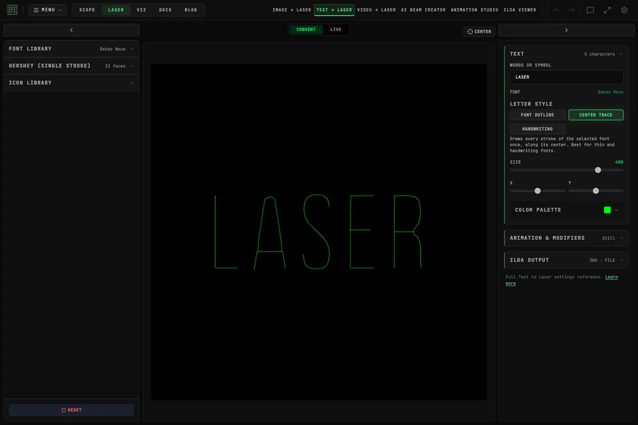
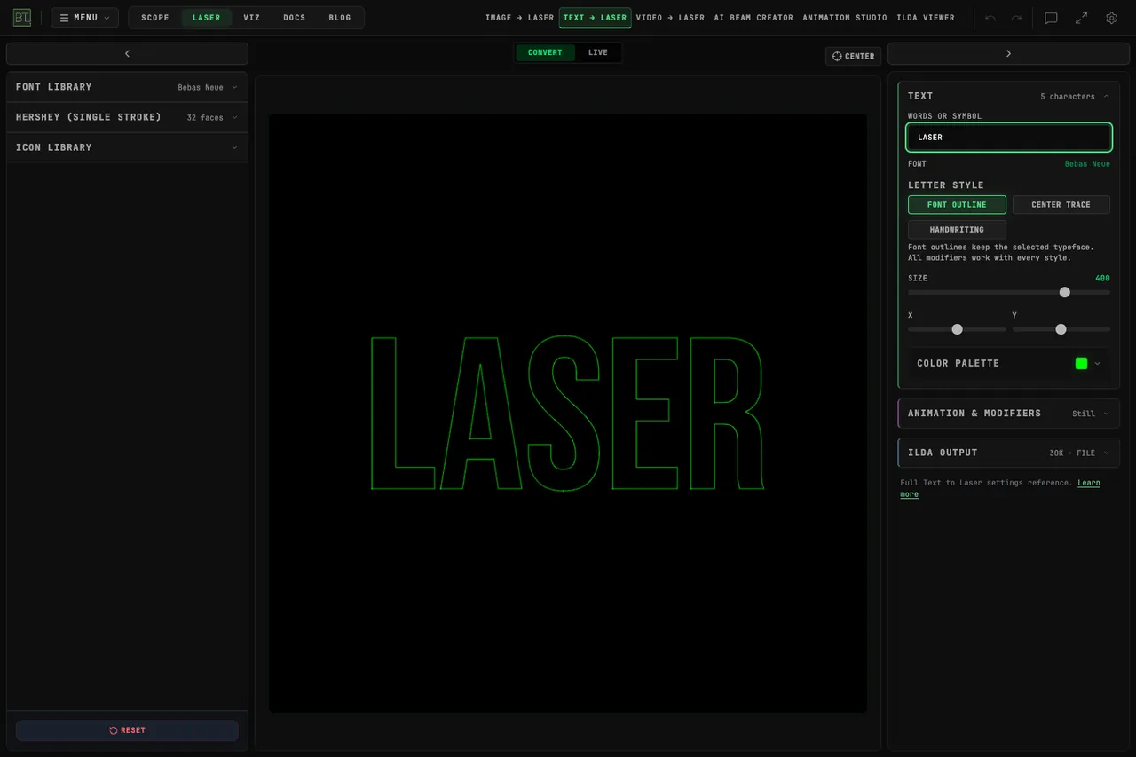 Font OutlineCenter Trace
What is the difference between Font Outline and Center Trace?
Font Outline follows the contours of the selected Google Font. Center Trace keeps that typeface but follows the center of its strokes. Compare both on your actual word: outlines preserve the letter’s contour treatment, while Center Trace can make thin lettering less crowded. The result depends on the face and characters.
An outline gives a thick letter two boundaries. That can be exactly the graphic style you want. Center Trace is useful when those boundaries sit too close together or when a writing effect should feel like one stroke. Neither option turns filled poster typography into solid projected ink.
| Choice | What stays | Useful starting point |
|---|---|---|
| FONT OUTLINE | The selected font’s contours | A recognizable outlined display face |
| CENTER TRACE | The selected font with center paths | Thin or handwriting-style lettering |
| HANDWRITING | BeamTracer’s single-stroke alphabet | A simple writing animation with supported characters |
| HERSHEY (SINGLE STROKE) | The selected vector stroke face | Direct stroke lettering without tracing a Google Font |
Compare the same word
Keep size and placement fixed while comparing styles. Don’t choose a winner from two previews that use different words, different zoom or different effects.
When should I choose a Hershey single-stroke font?
Choose a Hershey face when you want lettering already drawn as strokes. Open HERSHEY (SINGLE STROKE) below the font library and compare simple faces before ornate ones. A Hershey face changes the source typeface; LETTER STYLE doesn’t apply because the selected letters are already stroke drawings.
Try Roman Simplex for a plain reference, then compare a script or heavier face on the same word. Simplex, Duplex and Triplex describe different stroke treatments. A heavier face adds paths, so “single stroke” should not be read as a promise that every face takes identical drawing effort.
Roman Simplex, Script Simplex, Gothic English and Futura Medium on the same word.
For symbol and non-Roman faces, inspect the preview carefully. Their keyboard positions may represent different characters from the literal letters you typed. Don’t send a name to a client until you’ve checked every character.
Can I keep composing with my lettering in Animation Studio?
For FONT OUTLINE, use Continue in Animation Studio when the word needs to become vector artwork in a larger composition. The handoff carries the drawing, color, modifier settings and duration into an editable layer. It does not carry a text field for changing the original word or font. An exported ILDA file is drawing frames, not an editable typography document.
Add a simple Quick Start such as Write only after the letters themselves read clearly. Preview the start, middle and end of the animation. Effects can hide parts of a word temporarily; a readable final frame doesn’t prove the entire sequence is suitable for the message.
For animation recipes, use the Text to Laser guide and Animation Studio guide. This font comparison is about the source lettering rather than stacking more effects.
Check the destination
Text to Laser exports ILDA Format 5. If a player needs an older indexed-color format, convert a copy in ILDA Viewer and inspect that converted file. ILDA doesn’t store a playback frame rate; use the intended rate in the player as well as the export settings.
Does a clean preview mean the text is safe to project?
No. A browser preview shows a drawing, and ILDA Viewer helps inspect file health and scanner load. Neither is approval for a projector, a scan angle, a venue or an audience exposure. Read the laser-output guide before selecting a device or arming output.
Use physical safety controls
Keep the controlled beam area, masks, interlocks and emergency stop required by your physical setup. Never aim a laser at people because a font looks smooth on a screen.
Can I try laser lettering without a projector?
Yes. Use the browser preview to compare fonts and inspect an ILDA file without connecting a DAC. The Google Font library, Hershey faces and Material Symbols give you different starting artwork. Check current plans and export limits before downloading a batch.
Open Text to Laser, type one short word, and compare FONT OUTLINE, CENTER TRACE and Roman Simplex. Pick the drawing that communicates the word clearly before you add motion.